You are here: Getting Started > Using the Interface > Properties Panels > Controls That Appear on All Properties Panels

Controls That Appear on All Properties Panels

These are the standard controls of every properties panel:

Control

Function

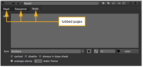
Hide or show the node’s tabbed pages.

Centers the node in the Node Graph.

Centers one of the node’s inputs in the Node Graph. Select the input from the dropdown menu that appears.

You can save, load and manage node presets here. See Customizing a Node’s Defaults with Node Presets.

name field (for example, Blur1)

You can enter a new name for the node here.

(left)

Changes the color of the node. You can drag and drop this button on top of another color button to copy the color. To revert to the default color defined in your Preferences, right-click on the button and select Set color to default.

An X on the button indicates the color is unset, and the color defined in the Preferences is used.

(right)

Changes the color used for the node’s controls in the Viewer. You can drag and drop this button on top of another color button to copy the color. To revert to the default color defined in your Preferences, right-click on the button and select Set color to default.

An X on the button indicates the color is unset, and the color defined in the Preferences is used.

Undoes the last change made to the node.

Redoes the last change undone.

Reverts any changes made after the properties panel was opened.

Displays a pop-up help related to the node and its controls.

Floats the properties panel. Clicking this button again docks the properties panel back in the Properties Bin if the Bin exists.

Closes the properties panel. Alt+click this to close all the properties panels in the Properties Bin. Ctrl/Cmd+click to close all properties panels except the one clicked on.

Floating control panels also include the following buttons:

Control

Function

Reverts any changes made after the properties panel was opened.

Reverts any changes made after the properties panel was opened and closes the properties panel. Hitting this button right after a node was created also deletes the node from the Node Graph.

Closes the properties panel.

Many properties panels also contain several tabbed pages.

The Read node’s properties panel and the Node tab.

On the Node tab, you can usually adjust the following controls:

Control

Function

label

Lets you add comments to the node. The comments are displayed on the node’s surface.

If you like, you can use HTML in the label field. For example, to have your comments appear in bold, you can enter <b>My Comment</b>. To add an icon called

MyIcon.png to the node, you can use <img src="MyIcon.png"/>. Save the icon in your plug-in path directory. (For more information on plug-in path directories, see Loading Gizmos, NDK Plug-ins, and Python and TCL Scripts in the Configuring Nuke chapter of the Nuke User Guide.) Most common image formats work, but we recommend using .png.

Note that the HTML has been changed to a slightly non-standard form where newlines are significant. If there is a newline character in your data, a new line is displayed in the label.

font

Lets you change the font for any text displayed on the node.

Bolds any text displayed on the node.

Emphasizes any text displayed on the node.

Lets you change the font size of any text displayed on the node.

Lets you change the color of any text displayed on the node.

hide input

Check this to hide the node’s incoming pipe. This control does not appear on all nodes.

cached

Check this to keep the data upstream from the node in memory, so that it can be read quickly. When this is checked, a yellow line displays under the node in the Node Graph.

disable

Check this to disable the node. Uncheck to re-enable. (You can also disable or re-enable a node by selecting it in the Node Graph and pressing D.)

always in dope sheet

Check this to force the node to always display in the Dope Sheet. You can also press Alt+D to toggle this on and off.

By default, the Dope Sheet displays all your Read nodes that have their control panels open, and any nodes you’ve used to create keyframes.

bookmark

Check this to show the node in the bookmark list. This allows you to quickly navigate to the node. For more information, see Bookmarking Nodes.

postage stamp

Check this to display a thumbnail render of the node’s output on its surface. You can also press Alt+P on the Properties Bin to toggle postage stamps.

static frame

If you want the postage stamp to display a fixed frame (rather than update to match the current frame), enter the frame to display here. For this to work, you also need to press Shift+S to open the Preferences dialog, go to the Node Graph tab, and make sure postage stamp mode is set to Static frame.

Note that if the frame number you use is outside the frame range for the node, it is clamped to the first or last frame in the range.